

 To edit our music video, we will be using Adobe Premiere Pro CS5.5 as our primary editing software. As well as this, we plan to use Adobe After Effects to create our effect with the shifting height of the paper piles in our studio setup. We also have another piece of software which we can use to create this effect: Cinema 4D Studio, though we would need to practice with this piece of software before deciding whether we will be using it.
Preparation:
In between the production of our rough edit and the start of post-production for our final music video, we decided to get some feedback from our teachers and members of our target audience. Overall, these are some of the more pervasive comments we received.
- In some instances, the lip-sync looked a little bit odd. This was due to a number of reasons: some of our shots were simply out of time, but there were also shots in which the microphone obstructs our lead singer's mouth, making it more difficult to see what line he is actually singing.
- The pacing of our music video needed some work, mainly during the choruses. Part of this was due to a shortage of varied footage, as we couldn't include any real shots of our drummer or master shots in the rough edit. Nevertheless, we agreed that the editing needed to pick up the pace during the chorus.
- One suggestion we received, which would also help to solve our issue with pacing, was to make the cuts more relevant. Essentially, we should cut shots of the same band member together rather than cut to different members of the band suddenly.
We plan to make improvements on all of this feedback.
During the edit:
The first thing we did before anything else was organise our footage, as this would allow us to edit our sequence efficiently:
 Our studio shots were organised by shot type and composition, as our Luke was the only member of the band in this footage. Our rooftop shots however, have been organised into groups depending on the member of band. If we had a shot with multiple members of the band in - excluding master shots - we put these shots in the folder of whichever member is the focal image.
From here, we copied our rough edit into our sequence and began to replace any of our weaker shots with the new footage from our main shoot. This process allowed us to gradually improve our sequence as well as fill in any gaps from our rough edit.
 The major change between our rough edit and our final edit was the inclusion of our grading: we had chosen to ignore the grading during our rough edit as the time was better spent ensuring that the shots we were including were suitable and of a high quality.
We decided to employ a black and white colour scheme. We had seen this used in other indie music videos such as Chocolate by The 1975, though we wanted to use an effect with higher contrast than this.
Additionally, we also graded our conceptual scene to create a sharper contrast. A comparison of our shots with and without this grading can be seen below.
After we had graded some of our performance shots, we decided to directly compare them to some of our references:
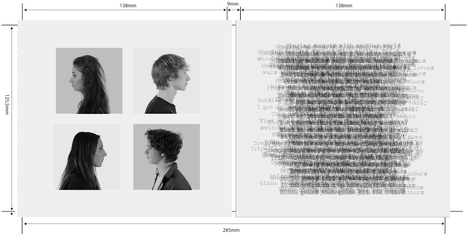
Lastly, we created the effect of the paper piles shifting height. Unfortunately we were only able to use this effect in two scenes due to time constraints, but the effect we were able to make means that the shots look much better than if we did not have this effect.
The first thing we did before anything else was organise our footage, as this would allow us to edit our sequence efficiently:
From here, we copied our rough edit into our sequence and began to replace any of our weaker shots with the new footage from our main shoot. This process allowed us to gradually improve our sequence as well as fill in any gaps from our rough edit.
 |
| We wanted a sharper contrast than in Chocolate |
We decided to employ a black and white colour scheme. We had seen this used in other indie music videos such as Chocolate by The 1975, though we wanted to use an effect with higher contrast than this.
Additionally, we also graded our conceptual scene to create a sharper contrast. A comparison of our shots with and without this grading can be seen below.
 |
| The top shot is graded whereas the bottom shot is not graded. We were able to increase the contrast between Luke's face and the background as well as make the background more white |
After we had graded some of our performance shots, we decided to directly compare them to some of our references:
 |
| This shot is taken from one of our references: Fear and Delight by The Correspondants. We thought this use of black and white was effective, though we wanted our black and white colour scheme to be darker to reflect our genre of indie rock. |
 |
| We then compared our shot to this shot from Chocolate. Again, our grading appears much darker, but we think that our genre of indie rock makes this darker colour scheme suitable. |

Below is the final version of our music video:
No comments:
Post a Comment